How your data is the key to help you navigate your way through COVID-19“
- Doug
- Oct 28, 2020
- 4 min read
Updated: Oct 29, 2020
“Using Control Charts and Alerts to Monitor Stability”
It is not uncommon for one to ask if we are in control? And while we may think we are, is it based on statistics or gut feel? If you were to plot client visits or one’s revenue during the first few months of the COVID pandemic clearly, we were all out of control.
A control chart is an instrument that can pinpoint (at a glance) how we are varying from the mean average using standard deviation in a positive and negative direction. By introducing a time range, one can understand and manage processes by month, bi-monthly, weekly or daily. In normal times and by comparing previous periods, we are able to interpret information as to how are we doing compared to budget as well as put in play corrective actions almost immediately when falling short. Replicating and building on processes that are working is what we strive for!
A good analytics platform and interactive dashboard can put this in reach for both large and small organizations.
Analytics Technique using Control Charts
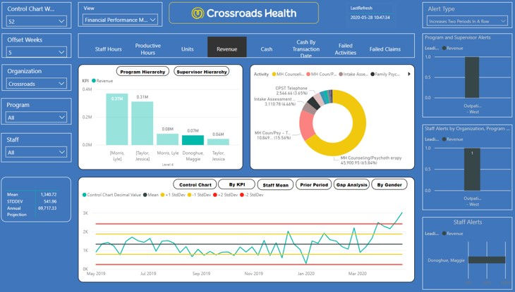
One proven analytical technique that is being leveraged for statistical analysis is control charts. In the example below, we can see that unit performance has decreased by two standard deviations post Covid-19 onset.

Control chart analysis for developing budgets (annual projections from the mean), or projections of future performance resulting from changes in means over time (such before / after the onset of COVID-19) are proven ways to gauge performance.
Best practice analysis tools such as control charts, comparisons of individual staff performance to the team mean, prior period analysis, and gap analysis are powerful tools for clinical and financial performance management.
The impact of changes in Clinical Operations on Financial Performance
Finance teams need to be able to translate clinical performance changes into financial terms (after all, no matter how well we perform on clinical measures, our bills are paid in cash). This means that finance needs insight into the impact of changes in clinical performance on revenue and cash.
Techniques for developing meaningful insight into the relationship between clinical performance measures and revenue and cash is a good problem solved by analytics. The impact clinical life cycle issues have on revenue can be calculated in terms of revenue opportunity to determine how the organization's financial position will be affected by changes in the clinical life cycle, allowing managers to weigh each issue's relative importance from a financial perspective.
Comparisons of revenue opportunity cost allow financial analysts to project revenue deltas resulting from changes in the clinical environment, such as projecting revenue shortfalls from the impact of social distancing on attendance and the introduction of tele-health into the service mix.

In the chart shown above, the revenue opportunity at appointments increased by about 1 standard deviation above the 24 week mean after the onset of social distancing, indicating a revenue shortfall of about $2K per week due to changes in attendance rates.
Collectively, analytics best practices allow an organization to shift the focus from analyzing data and dashboards to meaningful action, and provides them with a framework for leveraging widely accepted principles for total performance management (such as LEAN) that have been used successfully in other industries to achieve performance management and improvement.
Using Alerts in conjunction with Control Charts for a Focused Review
Alerts mine the data automatically to provide users with insights that would otherwise have to be gleaned by examining and analyzing multiple dashboards. Automated analysis at multiple levels of granularity, such as by program, supervisor, or staff, obviates the need for users to drill through the data to make their own discoveries.

While drilldowns and cross filters are powerful and essential tools, experience shows that requiring managers, supervisors and clinicians to drill through the data to make meaningful discoveries requires extensive training and experience. Relying on dashboard users to perform the analysis takes time away from their critical job functions, and can easily result in the most important insights being missed.
A flexible alert structure focused on identifying weekly changes in performance helps an organization recognize and respond to changes in their care environment (such as in the case of COVID-19), and/or changes in clinical or financial operations, and promotes a common understanding of the insights revealed by data - allowing organizations to focus on action, versus data analysis for its own sake.
Alerts provide a starting point for learning, "What's getting in our way?", and "What's helping us succeed?" The data that underlies the alerts must be made available to stakeholders in an intuitive way that allows them to develop their own understanding of the operational characteristics that drive performance. After all, they are the ones who know the most about the processes they're following and the obstacles they are encountering!
This requires a number of different perspectives on the data, including data visualization (illustrated below a daily trend chart for the measures selected), comparative analysis tools (such as gap analysis), comparison of means, comparison to prior periods, etc. Easy access to these views (click on an alert) allows users to reconcile the data with the alert and develop an understanding of the underlying causes.

If you are interested hearing more about how your organization can benefit from using an analytics platform to measure performance and drive decision making, please give us a call.
We would be glad to assist.
www.icentrixanalytics.com
603-893-3922 x703
Doug Philipon doug@icentrix.com


Comments